css
Mastering the :has() CSS Pseudo-Class for Improved Layouts
Explore the powerful :has() CSS pseudo-class to create dynamic, responsive layouts effortlessly, enhancing your web design capabilities.
:has() has been in all major browsers since late 2023, and that changes the threshold for using it in production. Most developers already know the syntax, but fewer have seen the patterns that actually remove JavaScript from a real codebase. Here are five worth shipping today, starting with a quick mental-model fix and a card layout you can test in a visual flexbox playground.
1. The rule that trips people up on day one
The mistake is simple: :has() styles the selector before the colon, not the element inside the parentheses. If that sounds obvious, it still catches people the first time they try to “target the child” with it. Keep this mental model locked in and the rest of the patterns make sense immediately.
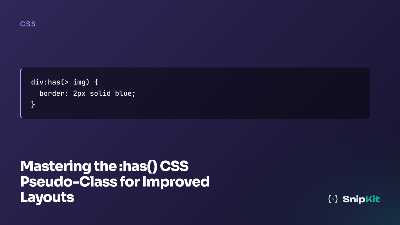
/* :has() styles the element BEFORE the colon */
/* This styles .card when it contains an img */
.card:has(img) {
display: grid;
grid-template-columns: 200px 1fr;
}
/* NOT the img itself */
/* Wrong mental model:
img:has(.card) { ... }
This would style the img if it contained .card, which it doesn't.
*/2. The card that rearranges itself when content changes
This is the first :has() pattern most teams should reach for because it shows up everywhere: CMS cards, search results, featured posts, product promos. A typical JavaScript version loops over cards, checks whether an image exists, and adds classes that only exist to drive layout.
document.querySelectorAll('.card').forEach((card) => {
if (card.querySelector('img')) card.classList.add('card--media');
else card.classList.add('card--text-only');
});You can replace that with CSS alone, including the absence case that usually gets skipped in examples but does half the real work.
<section class="cards">
<article class="card">
<img src="https://picsum.photos/360/240" alt="Sample cover image">
<div class="card__content">
<h3>Article with image</h3>
<p>This card switches to a horizontal layout because it contains an image.</p>
<a href="/">Read more</a>
</div>
</article>
<article class="card">
<div class="card__content">
<h3>Text-only update</h3>
<p>This one stays stacked and centers its content because there is no image.</p>
<a href="/blog">Browse posts</a>
</div>
</article>
</section>.cards {
display: grid;
gap: 1.5rem;
max-width: 900px;
margin: 2rem auto;
font-family: system-ui, sans-serif;
}
.card {
border: 1px solid #e5e7eb;
border-radius: 16px;
padding: 1rem;
background: white;
}
/* Stacked by default */
.card {
display: flex;
flex-direction: column;
gap: 1rem;
}
/* Horizontal when image is present */
.card:has(img) {
flex-direction: row;
align-items: flex-start;
}
.card:has(img) img {
width: 180px;
flex-shrink: 0;
object-fit: cover;
}
/* Text-only cards: centre content */
.card:not(:has(img)) {
align-items: center;
text-align: center;
}
.card__content {
display: flex;
flex-direction: column;
gap: 0.75rem;
}
.card h3 {
margin: 0;
}
.card p {
margin: 0;
color: #475569;
}
.card a {
color: #2563eb;
text-decoration: none;
font-weight: 600;
}That gives you one component that adapts to whatever content the CMS sends back. No “media” class, no “text-only” class, no hydration step that exists just to inspect descendants. If you want to tune the horizontal/vertical behavior, test the flex-direction switch in our flexbox playground first, then drop the final CSS into the component.
3. Form groups that react to focus and validation without listeners
This is probably the most practical :has() pattern in day-to-day UI work. Developers often attach focus, blur, and input listeners to each field just to toggle classes on a .form-group wrapper so the label, border, and background can react together.
document.querySelectorAll('.form-group input').forEach((input) => {
input.addEventListener('focus', () => input.parentElement.classList.add('is-focus'));
input.addEventListener('blur', () => input.parentElement.classList.remove('is-focus'));
input.addEventListener('input', () => {
input.parentElement.classList.toggle('is-invalid', !input.checkValidity());
input.parentElement.classList.toggle('is-valid', input.checkValidity());
});
});With :has(), the wrapper can style itself based on the input state directly. That keeps the markup cleaner and removes the “state mirroring” code that falls out of sync during refactors.
<form class="demo-form" novalidate>
<div class="form-group">
<label for="email">Email address</label>
<input id="email" name="email" type="email" placeholder="name@example.com" required>
</div>
<div class="form-group">
<label for="username">Username</label>
<input id="username" name="username" type="text" placeholder="snipkit-dev" minlength="3" required>
</div>
</form>.demo-form {
max-width: 420px;
margin: 2rem auto;
display: grid;
gap: 1rem;
font-family: system-ui, sans-serif;
}
.form-group {
border: 1px solid #cbd5e1;
padding: 0.75rem;
transition: 0.2s ease;
background: white;
}
.form-group label {
display: block;
margin-bottom: 0.5rem;
color: #0f172a;
}
.form-group input {
width: 100%;
padding: 0.75rem;
border: 1px solid #cbd5e1;
border-radius: 6px;
font: inherit;
}
/* Focus state on the wrapper */
.form-group:has(input:focus) {
outline: 2px solid #6366f1;
border-radius: 4px;
}
.form-group:has(input:invalid:not(:placeholder-shown)) {
border-color: #ef4444;
background: #fef2f2;
}
.form-group:has(input:invalid:not(:placeholder-shown)) label {
color: #ef4444;
}
.form-group:has(input:valid:not(:placeholder-shown)) {
border-color: #22c55e;
}The important detail is :not(:placeholder-shown), which avoids painting the field invalid before the user has typed anything. If you’re building a larger form system, pair this with the CSS text playground to sanity-check long labels, wrapped helper text, and overflow behavior inside narrow form layouts.
4. Required labels, no DOM walk needed
A lot of teams still annotate required labels with JavaScript after the page renders. That usually means finding all required inputs, walking to a sibling label, adding a class, and maybe injecting an asterisk.
document.querySelectorAll('input[required]').forEach((input) => {
const label = input.previousElementSibling;
if (label?.tagName === 'LABEL') label.classList.add('is-required');
});:has() can do this with the exact relationship you actually mean: style the label that is immediately followed by a required input.
<form class="account-form">
<div class="field-row">
<label for="full-name">Full name</label>
<input id="full-name" name="full-name" type="text" required>
</div>
<div class="field-row">
<label for="company">Company</label>
<input id="company" name="company" type="text">
</div>
<div class="field-row">
<label for="email-address">Email</label>
<input id="email-address" name="email-address" type="email" required>
</div>
</form>.account-form {
max-width: 420px;
margin: 2rem auto;
display: grid;
gap: 1rem;
font-family: system-ui, sans-serif;
}
.field-row {
display: grid;
gap: 0.5rem;
}
.field-row input {
padding: 0.75rem;
border: 1px solid #cbd5e1;
border-radius: 6px;
font: inherit;
}
/* Style the label that immediately precedes a required input */
label:has(+ input:required) {
font-weight: 600;
}
label:has(+ input:required)::after {
content: " *";
color: #ef4444;
}The combinator matters here. A descendant selector (label:has(input:required)) would look for an input inside the label. A direct-child selector (>) means “immediate child.” The adjacent sibling combinator (+) means “the next sibling only,” which is perfect when your markup is label followed by input. That precision is what makes this pattern useful instead of clever.
5. A sidebar toggle driven by CSS state, not a body class
The checkbox hack has been around for years, but :has() makes it much more usable because you can move the state up to body and let the outer layout respond. That replaces the common pattern where a click handler toggles a class on body or .app-shell.
const toggle = document.getElementById('sidebar-toggle');
toggle.addEventListener('change', () => {
document.body.classList.toggle('sidebar-open', toggle.checked);
});Here’s the same thing with CSS handling the state propagation.
<input type="checkbox" id="sidebar-toggle">
<div class="page">
<label for="sidebar-toggle" class="menu-button">Toggle sidebar</label>
<div class="app">
<aside class="sidebar">
<nav>
<a href="/">Dashboard</a>
<a href="/about">Reports</a>
<a href="/contact">Settings</a>
</nav>
</aside>
<main class="content">
<h2>Content area</h2>
<p>The layout opens when the checkbox is checked. No JS class toggling required.</p>
</main>
</div>
</div>html, body {
margin: 0;
font-family: system-ui, sans-serif;
}
#sidebar-toggle { display: none; }
.page {
min-height: 100vh;
}
.menu-button {
display: inline-block;
margin: 1rem;
padding: 0.75rem 1rem;
background: #111827;
color: white;
border-radius: 8px;
cursor: pointer;
}
/* Hidden checkbox acts as state */
.app {
display: grid;
grid-template-columns: 0 1fr;
transition: grid-template-columns 0.3s ease;
}
body:has(#sidebar-toggle:checked) .app {
grid-template-columns: 260px 1fr;
}
.sidebar {
overflow: hidden;
background: #1e293b;
color: white;
padding: 1rem 0;
}
.sidebar nav {
display: grid;
}
.sidebar a {
color: white;
text-decoration: none;
padding: 0.75rem 1rem;
}
.content {
padding: 1.5rem;
}For a production version, don’t stop at the visual toggle. You should sync the control with aria-expanded, ensure keyboard access is solid, and decide whether the hidden checkbox is the right state primitive for your app shell. But for smaller dashboards, docs sidebars, and filter trays, this removes a surprising amount of glue code.
6. Let the grid respond to item count
Dynamic lists are where :has() starts feeling like a real layout tool instead of a selector trick. Imagine a CMS-driven card list or search results page where you don’t know the item count at author time: two columns may look right for four items, but cramped for nine.
const grid = document.querySelector('.grid');
const count = grid.children.length;
if (count >= 5) grid.classList.add('grid--3-col');
if (count >= 9) grid.classList.add('grid--4-col');You can move those thresholds into CSS and let the layout adapt based on child count alone.
<section class="grid">
<article class="item">1</article>
<article class="item">2</article>
<article class="item">3</article>
<article class="item">4</article>
<article class="item">5</article>
<article class="item">6</article>
<article class="item">7</article>
</section>.grid {
display: grid;
grid-template-columns: repeat(2, 1fr);
gap: 1.5rem;
}
/* 3 columns when 5+ items are present */
.grid:has(.item:nth-child(n + 5)) {
grid-template-columns: repeat(3, 1fr);
}
/* 4 columns when 9+ items */
.grid:has(.item:nth-child(n + 9)) {
grid-template-columns: repeat(4, 1fr);
}
.item {
min-height: 120px;
display: grid;
place-items: center;
border-radius: 12px;
background: #e2e8f0;
font: 600 1.25rem/1 system-ui, sans-serif;
}This is especially useful when the content source is outside your control: faceted search, related posts, product recommendations, author archives. If you want to experiment with those column thresholds visually before committing them, use the grid generator to scaffold the layout, then layer the :has(.item:nth-child(...)) rules on top. And if the cards inside those columns also switch orientation based on media presence, you can combine this with the flexbox playground workflow from pattern one.
If one of these rules is load-bearing rather than progressive enhancement, wrap the behavior in @supports selector(:has(*)) and provide a fallback class-based layout for older environments you still support. Which of these five would remove the most JavaScript from your codebase right now? Start by testing the layout scaffolding in the flexbox playground and the grid generator, then swap the class-toggling code out where it no longer earns its keep.
Related tools
Flexbox Playground
Experiment with flex properties and see the CSS update live
Grid Generator
Define CSS Grid rows, columns, and gaps with a live preview
Clamp Calculator
Generate fluid CSS clamp() values for responsive typography and spacing
Spacing Scale Generator
Generate a modular spacing scale with CSS custom properties